Sprout template

This guide will lead you through the steps on setting up the Sprout template. Depending on your own needs and style, feel free to skip some of these steps. This manual provides information about setting up the additional features that come with Sprout, so it is a good idea to refer to the manual for your web shop platform for further instructions.


We created Sprout based on a redesign of the Rooty template. At the same time, we build the template around research about the latest web shop design trends and feedback from our customers.


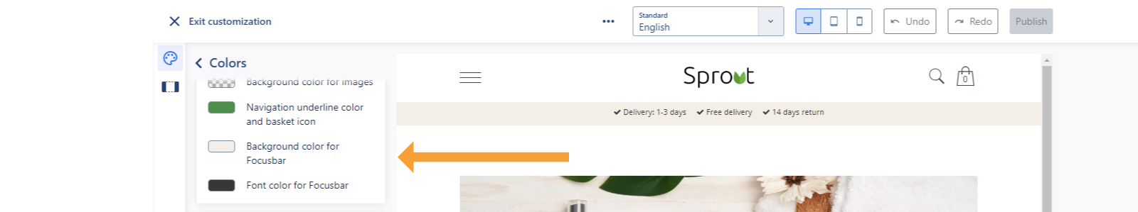
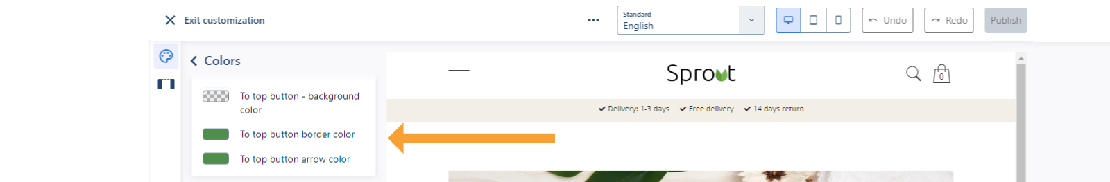
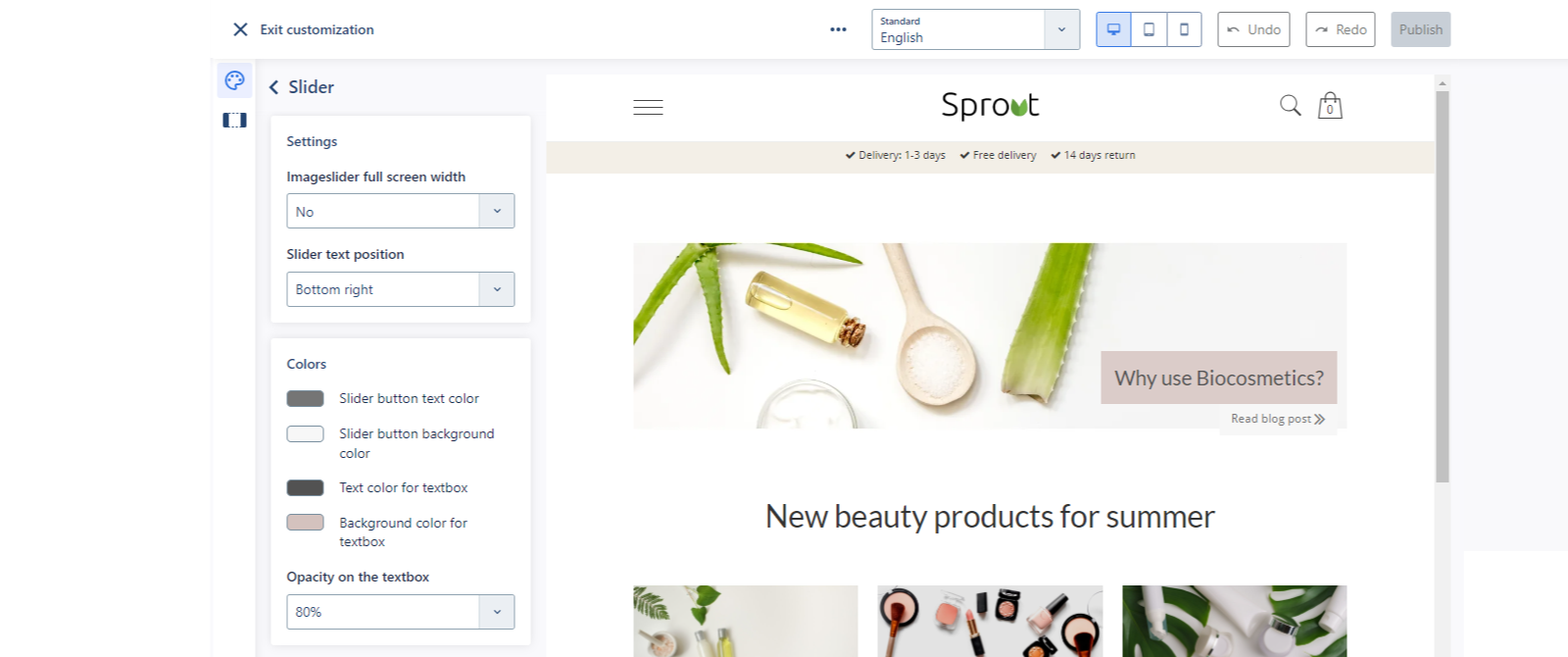
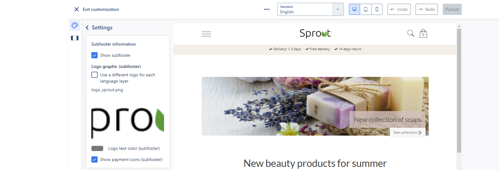
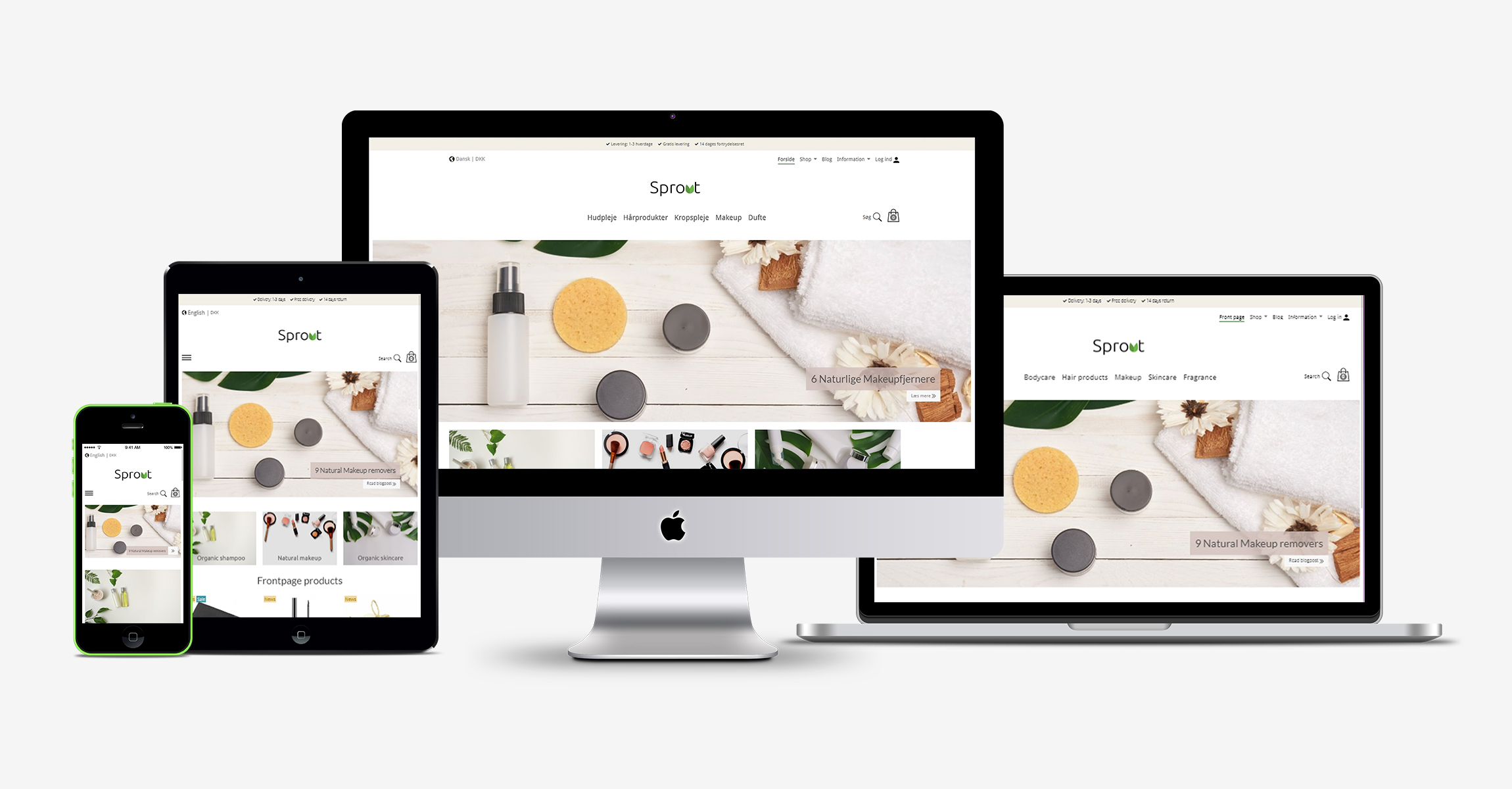
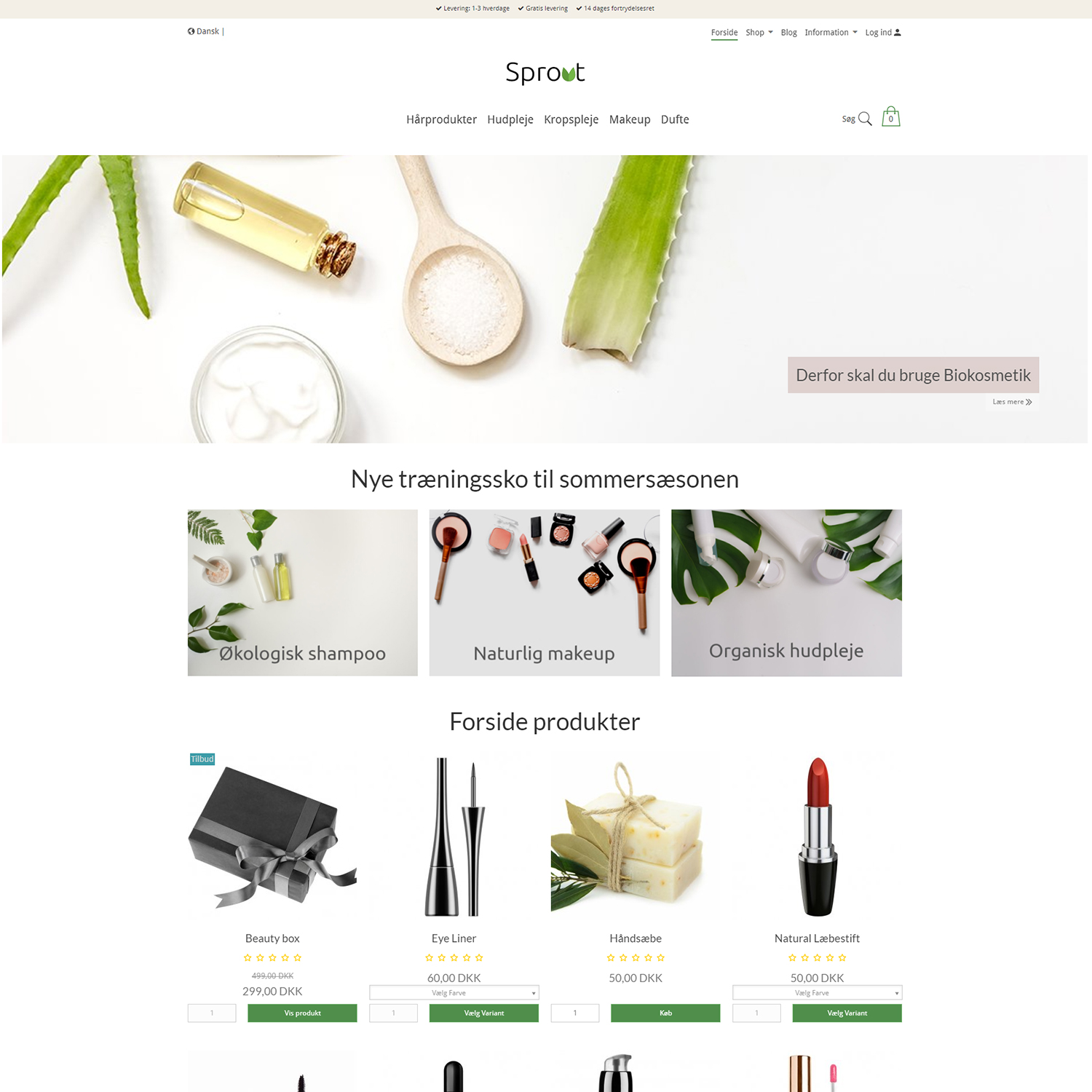
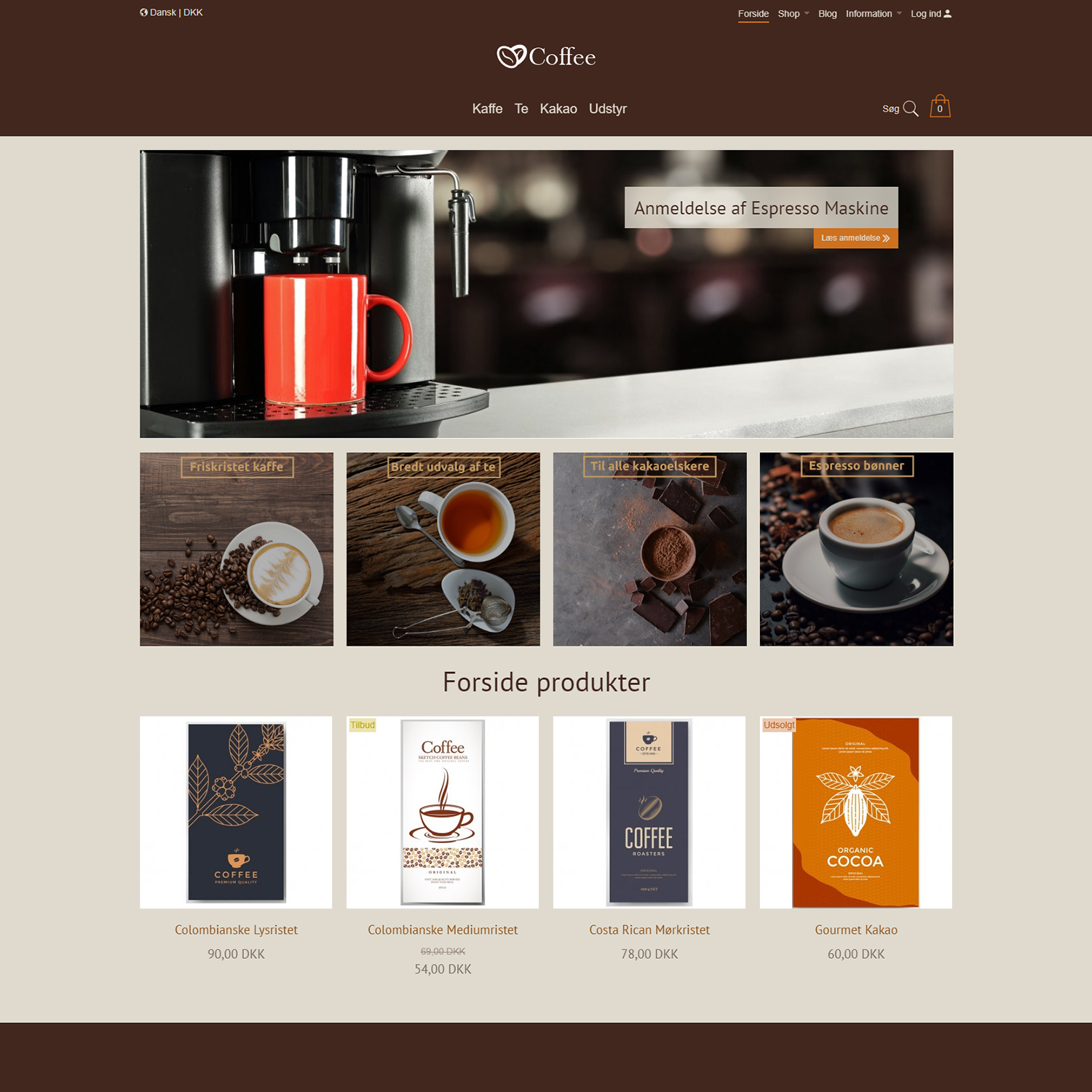
The template is ideal for start-ups or medium sized companies. Choose between three different color skins or create your own color skin that suits the visual identity of your company the most.

How to get started?

If you wish to use this template, follow these steps:

  • Log into your solution
  • Go to Online store > Design > Browse Design Store and choose the template that you wish to use
  • You can use the template right away
  • Customize you design so its suits your company
  • Activate your template


Once you have selected the Sprout template, click on Customize > Themes. Choose one of the three color themes or you can create your own. Press Save and click View Online to see your solution. If you want to make changes to the design, follow the manual below.

Sprout

Coffee

Bike It

Category List

Just like for the logo, you can choose to place the category navigation on the left or in the center. To change the category navigation position, go to the Online store > Design > Customize and find the Category Navigation Position field under Settings.


Click Publish to save the result.


Unique Selling Points (USP)

Use the USPs to communicate the benefits of using your web shop. For example, you can inform your customers about free shipping, quick delivery etc. You can add up to three USPs. To add your USPs go to the Online store > Design > Actions > Edit translations and write your Unique Selling Points.


You can also change the USP section background and text color from Online store > Design > Customize, so they suit to the rest of your web shop’s design. Under the Template color you will find the Background color for Focusbar and Font color for Focusbar settings.


Once you have filled in the fields with the desired text and colors, click Publish to save the results.


Back-to-Top Button

The Back-to-top button automatically scrolls the user to the top of the page when clicked. This makes the user's experience much more pleasant, because it eliminates the need of having to scroll back to the top every time they have reached the bottom of a page. To add or remove the button from the template, go to the Online store > Design > Customize and find the Settings and find the Show to top button and choose from the dropdown whether to show or hide the button.


In the Button colors section of the Design Manager, the button's colors can be customized by setting background, border and arrow colors.


Click Publish to save the result.

Picture Slider

Use the Picture slider to emphasize a specific product or blog post. To add images to the slider on the front page, follow:


  1. Under Page tree, find Front page and then Picture element
  2. Use the Upload file button to upload the desired images or select them from the Choose file button
  3. The images you want to display should have the size: 1240 x 440px or 1920 x 500px if you're using the full width setting
  4. If you want to display text and call-to-action buttons on your sliders, click on the Extra info button and fill the input fields
  5. Click Save and see the result


In the Online store > Design > Customize you can find a dedicated section for the Page Slider. These settings allow you to set the size of the slider (eg. full width). It is also possible to choose the position of the text box and the call-to-action button: top left, top right, bottom left or bottom right. To make the slider’s design fit the rest of the web shop, you can select the right colors for the button and the text box. Furthermore, you can choose to set the opacity for the text box using our predefined recommended options.


Play around with the settings clicking until you find what works best with the content.

Click Publish to save the changes.

Footer Settings

You may choose whether to display the Newsletter Subscription in the footer or not. First, go to the Online store > Design > Customize and find the Settings > Footer information. From the dropdown of the Show newsletter subscription setting you can choose yes or no.


If your subscription allows it, the news subscription form will show like this in the footer:


It is also possible to add/remove the subfooter of the template, which includes the logo and payment icons. First, go to the Online store > Design > Customize and find the Setting>Footer information. The Show subfooter setting enables you to show or hide it. It is also possible to control the visibility of the payment icons. You can upload a different logo image to use for this section using the Logo graphic (subfooter) setting. If you want to use a text logo, you can select a font color using the Logo text color (subfooter) setting. With these additional logo settings that are specific for the subfooter, you can make sure that your logo is visible regardless of the section's background color.


Click Publish to save the results.